Food is a visual and cultural experience.
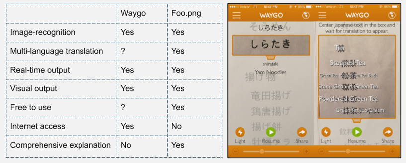
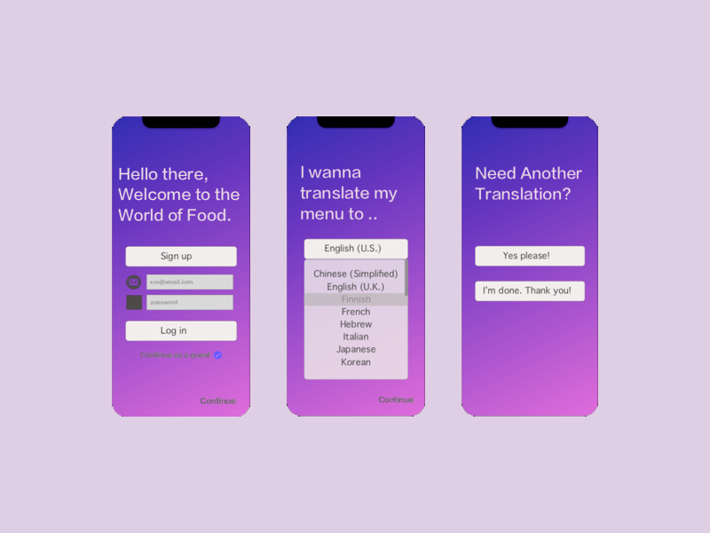
Foo.png is a mobile app that recognises and translates food information from text to image for international travllers, who can’t speak English or local language well.

Pain Points

  • Food as an important part of travelling abroad
  • Not knowing local language results in misunderstanding and miscommunication with restaurants
  • Insuffiicient/inconsistent infomration from menu
  • Degradation of decision-making process and dining experience
  • Goal

    By creating an image-recognizing food translator that can convert between different languages with visual output of the food, we will achieve the goal of helping users save time when ordering food with a more enjoyable dining experience abroad.
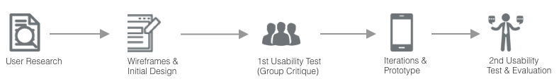
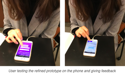

    Process

    User Research

    Primary Users: Young Adult International Travellers

    User Interview & Findings
  • 6 semi-structured interviews were conducted with primary users to find out their habits and troubles encountered when ordering food in an international trip
  • Menus with the images of food are really helpful when ordering food
  • Most of the users want to avoid direct communication with the servers
  • User Flow & Feature Priotirisation
  • The User flow of the app for ordering food is based on the findings from personas: user habits + user needs
  • A 2x2 Feature Prioritisation Matrix was made to highlight the features that best fit users’ needs: image-recoginition, visual & literal translations, and quick output

  • Competitor Analysis: Waygo

    After finalising the features of the product, I did a competitor analysis with Waygo, another similar product in order to compare and highlight the advantages of Foo.png.

    Ideation & Iteration

    Goal: To test out if the interface of the first design solution was clear to use by asking user to translate the menu, and observing the (in)consistency between their manipulation and designed user flow of the prototype.

    Process: A group critique was conducted in which 6 users were alternated to test and give immediate feedback during and after the testing.

    Findings
  • Scroll-bar made the steps seem skippable
  • Different modes of highlighting was not clear
  • Users should be asked to allow access to camera
  • Real-time graphics and immediate feedback: helpful for learning
  • Wordings should be more user-friendly
  • Final Design Solution & Evaluation

    After first round of user testing, I refined the prototype based on the feedback collected. I then conducted a second usability test and came up with the future improvements with the product.

    Next Step

    Interface
  • Improve Visual Design: more comprehensive theme colour and icons
  • Accessibility Design: support audio-oriented interface and different colour modes

  • User Flow
  • Personalised Settings: include translation history, option to save the searched food and to share it with friends
  • Detailed information of the food: audio pronunciation